nascode Blogs
Why Is Typography Important in Graphic Design?
By
https://www.flux-academy.com/blog/why-is-typograph
•12 April, 2021
Why Is Typography Important in Graphic Design?
The importance of typography in graphic design cannot be overstated. Typography contributes to legibility, hierarchy, and brand recognition. Let's explore how to effectively use typography in graphic design to achieve your objectives.
What is typography?
Typography has two main purposes in graphic design. The first is to promote legibility, and the second is to help communicate the message, tone, and sentiment of a design piece. Another function of typography revolves around aesthetics. We're drawn to visually attractive designs that are clean and easy on the eyes. In contrast, if a design is busy, confusing, and causes us to strain our eyes, we run the other way.
How to use typography in graphic design?
Hitting all the marks of effective and visually appealing typography in graphic design requires a solid u
nderstanding of basic design principles. Through practice, you'll develop an eye for good typography and will get better at making strategic design choices. Below are some fundamental concepts to keep in mind when using typography in graphic design.
Typeface vs. font
The terms "typeface" and "font" are often used interchangeably. In fact, when most people say "font," what they're really referring to is a typeface. As a graphic designer, it's important to understand the difference between these terms.
A typeface is a family of fonts. Some familiar examples include Times New Roman, Arial, and Brush Script. A font is a variation of a typeface, typically bold, italic, or a combination of the two. Examples of fonts include Times New Roman Italic and Arial Bold.
Choosing and pairing fonts
Selecting and pairing fonts for a graphic design are two skills and art forms themselves. The chosen font or fonts should fit the mood and tone of the message and be easily legible. If you can master the skills of font selection and pairing, the value of your graphic design work will reach new heights.
When pairing two fonts, there are essentially two recommended ways to go about it. The first is to pair two different fonts within the same typeface. For instance, a bold, uppercase font for headings and its regular counterpart for body text. The other option is to choose two different typefaces that contrast with one another. For example, a sans serif for headings and a serif for the body. As a general rule of thumb, avoid pairing two different fonts or typefaces with very subtle differences; as visible contrast between the two should be present.
Creating contrast
Contrast is critical in graphic design, especially where typography is concerned. High color contrast between the type and the background improves legibility. A simple and effective example of contrast in typography is black text on a white background. However, there are many ways to create contrast through the strategic use of color.
Other ways to create contrast with typography are through pairing different typefaces and font weights (as discussed above), and through sizing. For example, a large heading contrasts with small body copy.
The importance of typography in graphic design
As you know, converting text into a design isn't a simple copy-paste job. It requires both strategy and a good eye for visual aesthetics. Whether you're designing a landing page, book cover, or logo, you may spend countless hours just playing with the type. Why do we put so much time and energy into typography? In no particular order, let's go over the top eight reasons why typography is important in graphic design.
1. Deliver a message
Graphic design is all about visual communication. Through typography, we can heighten the message of a design in a clear and legible way. In a design that's primarily image-based, the typography needs to be strong enough to get noticed. In a text-heavy design, we need to use typography design in order to differentiate different sections and call attention to important messages. Either way, there needs to be an intentional and harmonious balance between different competing elements in order to get the primary message across quickly and easily.
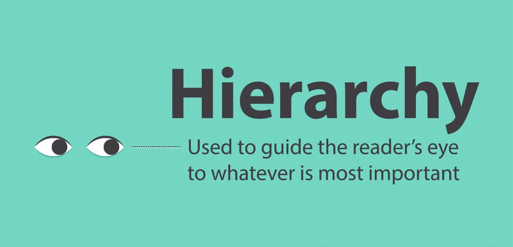
2. Create hierarchy
One important way typography is used in graphic design is to create visual hierarchy. This is often accomplished through sizing; the largest element on the page naturally draws the eye first. In a text-heavy graphic design, such as a newspaper or brochure, the headlines stand out and draw attention because they're larger than the body text.
Another way to create typographic hierarchy is through the combination of different typefaces. For instance, using a geometric sans serif typeface for headings and a classic serif for the body. The standard approach is to establish three levels of typographic hierarchy: headings, subheadings, and body copy. Each level utilizes a different font, and the hierarchy is further established through sizing.
3. Build brand recognition
A powerful role of typography in graphic design is to establish and grow brand recognition. This is especially true when it comes to logo design. When you think about popular brands like Coca-Cola, Harley-Davidson, and Disney, you can easily visualize their unique logotype in your mind.
The same concept holds true for other variations of graphic design; for instance, the simple, sans-serif typeface Instagram uses for their app user interface. Creating brand recognition through typography helps create a unique attachment and feeling of familiarity between the brand and the consumer.
4. Show personality
Some typefaces, particularly in the display category, add personality to a graphic design. The intentional use of typography can indicate whether a brand is playful, warm, mysterious, edgy, youthful, refined, and so on. Therefore, it's important to understand the traits of a brand or design project in order to use typography that conveys the right personality.
Bold and rounded typography is typically used to convey playfulness and friendliness in graphic design. In contrast, thin and subtle letterforms give off an air of sophistication and sincerity. With a little bit of practice, it's fairly easy to read the personality of a given typeface and decide whether it's a good fit for your project.
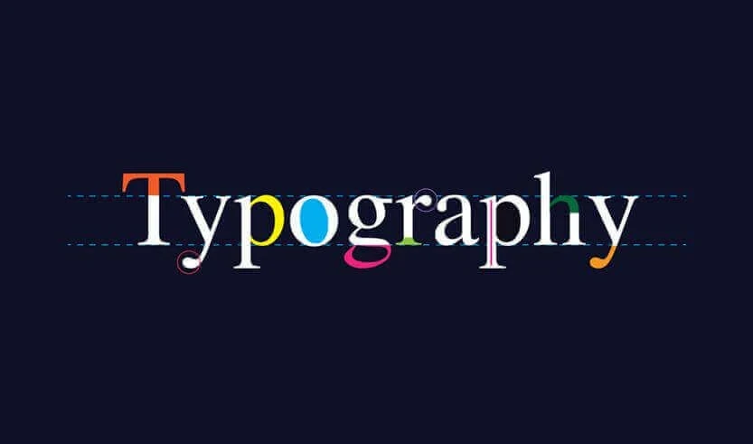
5. Make an impact
Typography can create a strong visual impact. There are many ways to get creative with typography in graphic design in order to make an impression on the viewer. It can even be used in such a way that no other supporting visuals are needed in order to effectively communicate the message of the design.
Below are some examples of graphic designs in which typography is front and center and makes a marked impact. In these examples, the typography is essentially art; it takes a lot of skill and artistic ability to pull off this effect.
6. Establish a mood and tone
Similarly to how typography conveys personality, it also helps establish the mood and tone of a graphic design piece. In this way, typography visually brings out a brand's values, without needing to explicitly state what those values are. For instance, a brand that values minimalism can help convey this value through the use of a modern, lightweight sans serif font.
Typography can also heighten the emotional factor of a piece of text, thus typography is so important for establishing mood, tone, and feeling.
7. Draw attention
One of the most important roles of typography is to draw attention to important messages. Typography is an easy and impactful method for making a word or phrase stand out in a design. Some ways to draw attention through typography include increasing the size, changing the color, and changing the font or typeface to contrast with the surrounding elements.
8. Create harmony and consistency
Typography helps create harmony and consistency in a design. In brand identity design, it's important to create visual consistency across all platforms. In website design, this looks like using consistent heading and body fonts throughout the site. Visual consistency creates a professional and streamlined look and promotes brand recognition.
Harmony in graphic design refers to visual balance and continuity. Harmonious designs are easy to follow and aesthetically appealing.
Typeface vs. font
The terms "typeface" and "font" are often used interchangeably. In fact, when most people say "font," what they're really referring to is a typeface. As a graphic designer, it's important to understand the difference between these terms.
A typeface is a family of fonts. Some familiar examples include Times New Roman, Arial, and Brush Script. A font is a variation of a typeface, typically bold, italic, or a combination of the two. Examples of fonts include Times New Roman Italic and Arial Bold.
Choosing and pairing fonts
Selecting and pairing fonts for a graphic design are two skills and art forms themselves. The chosen font or fonts should fit the mood and tone of the message and be easily legible. If you can master the skills of font selection and pairing, the value of your graphic design work will reach new heights.
When pairing two fonts, there are essentially two recommended ways to go about it. The first is to pair two different fonts within the same typeface. For instance, a bold, uppercase font for headings and its regular counterpart for body text. The other option is to choose two different typefaces that contrast with one another. For example, a sans serif for headings and a serif for the body. As a general rule of thumb, avoid pairing two different fonts or typefaces with very subtle differences; as visible contrast between the two should be present.
Creating contrast
Contrast is critical in graphic design, especially where typography is concerned. High color contrast between the type and the background improves legibility. A simple and effective example of contrast in typography is black text on a white background. However, there are many ways to create contrast through the strategic use of color.
Other ways to create contrast with typography are through pairing different typefaces and font weights (as discussed above), and through sizing. For example, a large heading contrasts with small body copy.
The importance of typography in graphic design
As you know, converting text into a design isn't a simple copy-paste job. It requires both strategy and a good eye for visual aesthetics. Whether you're designing a landing page, book cover, or logo, you may spend countless hours just playing with the type. Why do we put so much time and energy into typography? In no particular order, let's go over the top eight reasons why typography is important in graphic design.
1. Deliver a message
Graphic design is all about visual communication. Through typography, we can heighten the message of a design in a clear and legible way. In a design that's primarily image-based, the typography needs to be strong enough to get noticed. In a text-heavy design, we need to use typography design in order to differentiate different sections and call attention to important messages. Either way, there needs to be an intentional and harmonious balance between different competing elements in order to get the primary message across quickly and easily.
2. Create hierarchy
One important way typography is used in graphic design is to create visual hierarchy. This is often accomplished through sizing; the largest element on the page naturally draws the eye first. In a text-heavy graphic design, such as a newspaper or brochure, the headlines stand out and draw attention because they're larger than the body text.
Another way to create typographic hierarchy is through the combination of different typefaces. For instance, using a geometric sans serif typeface for headings and a classic serif for the body. The standard approach is to establish three levels of typographic hierarchy: headings, subheadings, and body copy. Each level utilizes a different font, and the hierarchy is further established through sizing.
3. Build brand recognition
A powerful role of typography in graphic design is to establish and grow brand recognition. This is especially true when it comes to logo design. When you think about popular brands like Coca-Cola, Harley-Davidson, and Disney, you can easily visualize their unique logotype in your mind.
The same concept holds true for other variations of graphic design; for instance, the simple, sans-serif typeface Instagram uses for their app user interface. Creating brand recognition through typography helps create a unique attachment and feeling of familiarity between the brand and the consumer.
4. Show personality
Some typefaces, particularly in the display category, add personality to a graphic design. The intentional use of typography can indicate whether a brand is playful, warm, mysterious, edgy, youthful, refined, and so on. Therefore, it's important to understand the traits of a brand or design project in order to use typography that conveys the right personality.
Bold and rounded typography is typically used to convey playfulness and friendliness in graphic design. In contrast, thin and subtle letterforms give off an air of sophistication and sincerity. With a little bit of practice, it's fairly easy to read the personality of a given typeface and decide whether it's a good fit for your project.
5. Make an impact
Typography can create a strong visual impact. There are many ways to get creative with typography in graphic design in order to make an impression on the viewer. It can even be used in such a way that no other supporting visuals are needed in order to effectively communicate the message of the design.
Below are some examples of graphic designs in which typography is front and center and makes a marked impact. In these examples, the typography is essentially art; it takes a lot of skill and artistic ability to pull off this effect.
6. Establish a mood and tone
Similarly to how typography conveys personality, it also helps establish the mood and tone of a graphic design piece. In this way, typography visually brings out a brand's values, without needing to explicitly state what those values are. For instance, a brand that values minimalism can help convey this value through the use of a modern, lightweight sans serif font.
Typography can also heighten the emotional factor of a piece of text, thus typography is so important for establishing mood, tone, and feeling.
7. Draw attention
One of the most important roles of typography is to draw attention to important messages. Typography is an easy and impactful method for making a word or phrase stand out in a design. Some ways to draw attention through typography include increasing the size, changing the color, and changing the font or typeface to contrast with the surrounding elements.
8. Create harmony and consistency
Typography helps create harmony and consistency in a design. In brand identity design, it's important to create visual consistency across all platforms. In website design, this looks like using consistent heading and body fonts throughout the site. Visual consistency creates a professional and streamlined look and promotes brand recognition.
Harmony in graphic design refers to visual balance and continuity. Harmonious designs are easy to follow and aesthetically appealing.


Link copied to clipboard!
