Time for a Refresh? Know When and Why?
Before we get started, you should know that there is a big difference between rebranding and refreshing your brand.
Rebranding is changing your brand positioning, values, guidelines, mission and vision statements and overall visual branding. You may have the same name, but you don’t have the same appearance once you rebrand, and that’s the whole point. Whereas refreshing your brand is tweaking small details to give your brand an updated, polished, modernized look. It might include: uplifting your current design or logo, updating your slogan, changing your color palette, refreshing marketing materials, or using a new font.
5 signs you should start thinking of a brand refresh:
- Visually Inconsistent
Think of all the well-known brands like Coca-Cola for example, how easy is it to recognize it with its iconic red color with white script. Being well-known doesn’t happen overnight, it demands a visual consistency for years. This includes logo, color palette, graphic elements and textures, fonts and brand imagery.
Why your brand’s visuals are important? Simply, because it’s the first thing people see, whether it’s through social media platforms, your website, graphics, signage, print ads, paid ads, etc. If these elements are inconsistent, it’ll leave your customers confused and unable to recognize you.
- Your Brand doesn’t reflect your values
As a brand you need to be a leader not a follower in your industry. Therefore, the brand should bring your values to the forefront. Identify what matters to you and the values you want your customers to gain from your brand to establish yourself and your image. If you are just copying your competitors and mimicking their values, it will only leave you lost, that’s your call for a refresh.
- Your Audience has changed
You’re not the same brand that you were when you started. You’ll speak differently to your audience than you did in the past and try new things to evolve further. With a larger audience comes new demographics and bigger responsibilities. Your audience may want to see more from you. You should consider fresh campaigns and new ways to target than you did before.
- Your overall design looks outdated
“Just because it worked in the past, doesn’t mean it works now.” Your brand’s design should look fresh and updated not as if it was created in Microsoft’s “Paint” program. Even some of the most recognizable brands update their logos and branding every few years to keep up with modern aesthetics. Take this step with confidence and creativity.
- Confusing Mission
Sometimes you can start with a strong mission and then get lost in the vast marketing world. Whenever you feel like you have lost your goals or your audience doesn’t know who you are, it might be the right time to rediscover who your brand is, what is your mission and how you can move forward.

Why is a Brand Refresh Important?
- Don't get left behind! Evolving brands stay relevant by adapting to changing customer preferences, market trends, and societal norms. A brand refresh can be your key to staying modern and connected.
- Growing pains? Your audience may evolve as your business does. A brand refresh bridges the gap, ensuring you resonate with both existing and new customers.
- Stay connected with your customers! A brand refresh keeps your image fresh and relatable, ensuring your customers see how your offerings continue to align with their needs.
- Level up your competitive edge! A brand refresh isn't just a facelift, it's a strategic move. It allows you to stand out from the competition and capture the attention of your target audience.
- Shine a light on your excellence! A modern brand image reflects your dedication to excellence, reassuring existing customers and attracting new ones who value quality.
px ] * Th-16-638582009073417174.png Found in DynamicImages\GeneralImages https://www.nascode.com/DynamicImages/GeneralImages/Th-16-638582009073417174.png)

px ] * Th-16-638582009073417174.png Found in DynamicImages\GeneralImages https://www.nascode.com/DynamicImages/GeneralImages/Th-16-638582009073417174.png)
A living example:
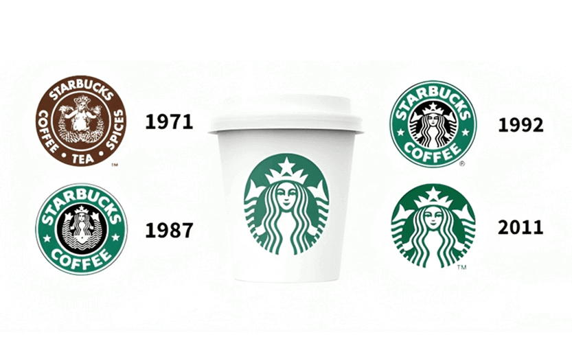
Starbucks is a global coffee giant known for its range of coffee products and related services.
The challenge: The company sought to reflect its evolution beyond coffee through a refreshed brand image.
The solution: Starbucks simplified its logo by removing the "Starbucks Coffee" text and focusing instead on the iconic mermaid image.
The result: The simplified logo symbolized Starbucks' expansion beyond coffee. It represented a broader range of Starbucks products and services.
Ready to elevate your brand and showcase your quality? Contact Nascode today, we’ll show you how to refresh the right way!