nascode Blogs
Impact of color on design
By
https://www.designcontest.com/blog/choosing-colors
•28 July, 2020
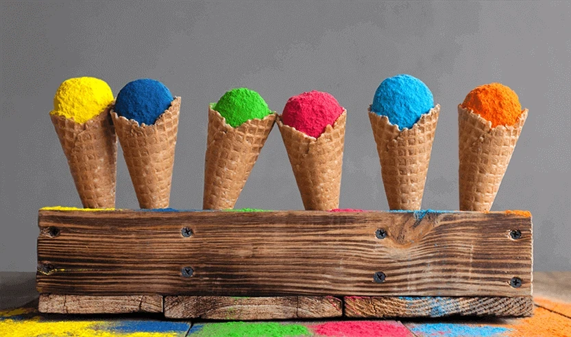
Deciding on the right color is one of top priorities when creating a new design. Plus, it’s a very difficult task. Sometimes the color you have chosen to use in the design project is as meaningful and important as a font or image. Not only it is the main attention grabber, it’s also proven to have a psychological effect on consumers. It triggers their imaginary and creates various associations.
Therefore, color is a powerful tool. It has an ability to influence and change one’s mood. Mood of a potential consumer.
Though, according to this critical review on Color Psychology, perception of color depends not only on the culture one grew up in, but also on personal experience, upbringing, preferences and just the simple visual effect each color has on a different individual.
Since everyone perceives colors differently there is no such thing as “ideal color palette” that would suit to enchant everyone. In order to make effective design one has t
o study and understand the meaning of color to convey the message to the target audience. Even if there is no “universal” color, you may find the one that would suit your purpose.
Every color “family” has a different meaning behind it, so let’s discover them:
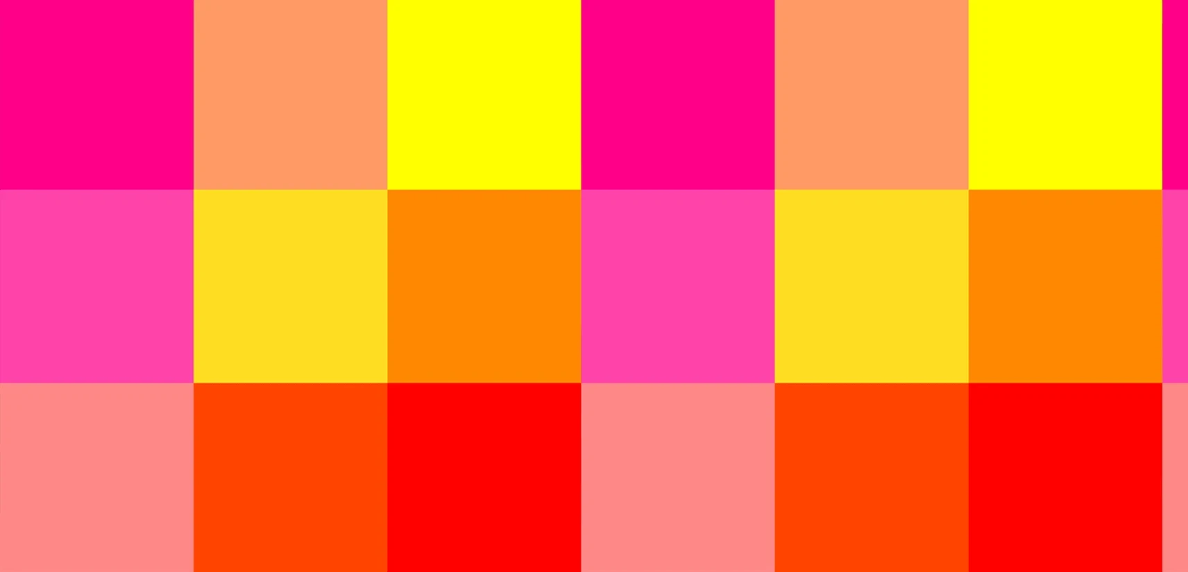
Warm Colors:
Those include red, orange, yellow and their variations. They create the feeling of passion, happiness, enthusiasm and energy. Red and Yellow are primary colors in this color palette.
Red is associated with passion and warfare. It is considered to be a color of danger (red light or a stop sign), but also a color of importance (red carpet, red ribbon of fighting AIDS program). In Asia red is color of prosperity and happiness, in Japanese culture there is a belief that two fated lovers are tied together by red string of fate. Again, red is associated with love.
According to Kathy Lamancusa, famous trend strategist, red is a color that draws attention and provokes to take action. It means red is a powerful color for design. However, it can be overwhelming if used too much. Red also is versatile, as brighter shades are full of energy, and darker ones are sophisticated and elegant.
Yellow is a color of energy and enthusiasm, which is associated with happiness and sunshine. If you want your design to rise feelings of cheerfulness and happiness then yellow is exactly what you need. At the wartime women wore yellow ribbons which meant them waiting for their husbands to come back. After that, it is also considered as a color of hope.
Because of its brightness it is often used for hazard and warning signs.
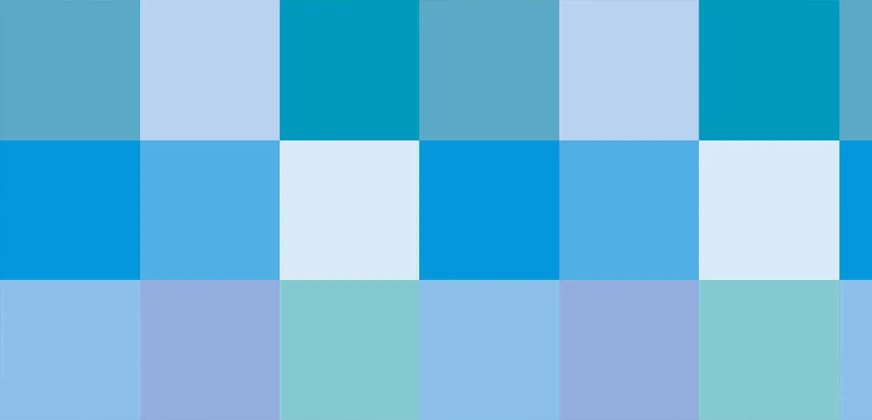
Cool colors:
There are green, blue and purple colors in this group. The primary one is blue, meaning two others are created from combining it with bright colors (mix blue and yellow to end with green, blue and red to get purple).
Blue in English language often refers to sadness and depression, i.e. “feeling blue”, “blue Monday”. Also it is associated with peace and calmness. The meaning of blue varies depending on the shade and hue. Light blue-s create calm and relaxing atmosphere, whereas bright blue-s bring energy and refreshment. Dark blue represents strength and balance.
Blue color gives design the cool and collected feeling.
Green may give the same calm feeling as blue, or bring energy similar to yellow. It is associated with health, growth and renewal. Green is mainly used in design of eco-friendly products and organizations (anything to do with nature, really). It is also a color of safety, like a green light to go or a green quarantine zone.
Purple is associated with royalty and wealth. It is a combination of red and blue colors.
In design, darker shades of purple create the atmosphere of luxury and wealth, while light shades are rather romantic and easygoing.
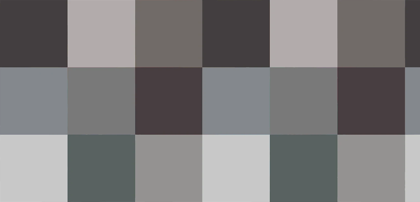
Neutrals:
Neutral colors are often used to create background. Despite that, they may be used alone to create rather refined layouts.
Black is the most prominent neutral color. In Western culture it is a traditional color for mourning. It is considered elegant and powerful as well as the color of mystery and death. Because of its neutrality black is often applied for functional parts of design such as typography and background image.
White is an opposite to black on the color spectrum. Just like black, it matches any color. White represents purity and innocence, cleanliness. When used as a main color, it can give a sharp, professional appearance.
Grey is a neutral, balanced color. It is a cool color that rarely evokes a strong emotion, but does have a sense of dependability or security. Grey is commonly used for typography.
Brown is a natural, earthy color. It can symbolize nature, stability, and down-to-earth reliability, but too much brown can seem lazy or dull, re. It is considered to be a color of danger (red light or a stop sign), but also a color of importance (red carpet, red ribbon of fighting AIDS program). In Asia red is color of prosperity and happiness, in Japanese culture there is a belief that two fated lovers are tied together by red string of fate. Again, red is associated with love.
According to Kathy Lamancusa, famous trend strategist, red is a color that draws attention and provokes to take action. It means red is a powerful color for design. However, it can be overwhelming if used too much. Red also is versatile, as brighter shades are full of energy, and darker ones are sophisticated and elegant.
Yellow is a color of energy and enthusiasm, which is associated with happiness and sunshine. If you want your design to rise feelings of cheerfulness and happiness then yellow is exactly what you need. At the wartime women wore yellow ribbons which meant them waiting for their husbands to come back. After that, it is also considered as a color of hope.
Because of its brightness it is often used for hazard and warning signs.
Cool colors:
There are green, blue and purple colors in this group. The primary one is blue, meaning two others are created from combining it with bright colors (mix blue and yellow to end with green, blue and red to get purple).
Blue in English language often refers to sadness and depression, i.e. “feeling blue”, “blue Monday”. Also it is associated with peace and calmness. The meaning of blue varies depending on the shade and hue. Light blue-s create calm and relaxing atmosphere, whereas bright blue-s bring energy and refreshment. Dark blue represents strength and balance.
Blue color gives design the cool and collected feeling.
Green may give the same calm feeling as blue, or bring energy similar to yellow. It is associated with health, growth and renewal. Green is mainly used in design of eco-friendly products and organizations (anything to do with nature, really). It is also a color of safety, like a green light to go or a green quarantine zone.
Purple is associated with royalty and wealth. It is a combination of red and blue colors.
In design, darker shades of purple create the atmosphere of luxury and wealth, while light shades are rather romantic and easygoing.
Neutrals:
Neutral colors are often used to create background. Despite that, they may be used alone to create rather refined layouts.
Black is the most prominent neutral color. In Western culture it is a traditional color for mourning. It is considered elegant and powerful as well as the color of mystery and death. Because of its neutrality black is often applied for functional parts of design such as typography and background image.
White is an opposite to black on the color spectrum. Just like black, it matches any color. White represents purity and innocence, cleanliness. When used as a main color, it can give a sharp, professional appearance.
Grey is a neutral, balanced color. It is a cool color that rarely evokes a strong emotion, but does have a sense of dependability or security. Grey is commonly used for typography.
Brown is a natural, earthy color. It can symbolize nature, stability, and down-to-earth reliability, but too much brown can seem lazy or dull, fading into the background rather than standing out. It is usually used as a background color, which gives this homey-warm feeling. Those darkest shades are used same as black color for background or typography.
Of course this may be little overwhelming at first, but studying color theory is essential for understanding which shade of color should be utilized to evoke a particular feeling in targeted audience.
Every color “family” has a different meaning behind it, so let’s discover them:
Warm Colors:
Those include red, orange, yellow and their variations. They create the feeling of passion, happiness, enthusiasm and energy. Red and Yellow are primary colors in this color palette.
Red is associated with passion and warfare. It is considered to be a color of danger (red light or a stop sign), but also a color of importance (red carpet, red ribbon of fighting AIDS program). In Asia red is color of prosperity and happiness, in Japanese culture there is a belief that two fated lovers are tied together by red string of fate. Again, red is associated with love.
According to Kathy Lamancusa, famous trend strategist, red is a color that draws attention and provokes to take action. It means red is a powerful color for design. However, it can be overwhelming if used too much. Red also is versatile, as brighter shades are full of energy, and darker ones are sophisticated and elegant.
Yellow is a color of energy and enthusiasm, which is associated with happiness and sunshine. If you want your design to rise feelings of cheerfulness and happiness then yellow is exactly what you need. At the wartime women wore yellow ribbons which meant them waiting for their husbands to come back. After that, it is also considered as a color of hope.
Because of its brightness it is often used for hazard and warning signs.
Cool colors:
There are green, blue and purple colors in this group. The primary one is blue, meaning two others are created from combining it with bright colors (mix blue and yellow to end with green, blue and red to get purple).
Blue in English language often refers to sadness and depression, i.e. “feeling blue”, “blue Monday”. Also it is associated with peace and calmness. The meaning of blue varies depending on the shade and hue. Light blue-s create calm and relaxing atmosphere, whereas bright blue-s bring energy and refreshment. Dark blue represents strength and balance.
Blue color gives design the cool and collected feeling.
Green may give the same calm feeling as blue, or bring energy similar to yellow. It is associated with health, growth and renewal. Green is mainly used in design of eco-friendly products and organizations (anything to do with nature, really). It is also a color of safety, like a green light to go or a green quarantine zone.
Purple is associated with royalty and wealth. It is a combination of red and blue colors.
In design, darker shades of purple create the atmosphere of luxury and wealth, while light shades are rather romantic and easygoing.
Neutrals:
Neutral colors are often used to create background. Despite that, they may be used alone to create rather refined layouts.
Black is the most prominent neutral color. In Western culture it is a traditional color for mourning. It is considered elegant and powerful as well as the color of mystery and death. Because of its neutrality black is often applied for functional parts of design such as typography and background image.
White is an opposite to black on the color spectrum. Just like black, it matches any color. White represents purity and innocence, cleanliness. When used as a main color, it can give a sharp, professional appearance.
Grey is a neutral, balanced color. It is a cool color that rarely evokes a strong emotion, but does have a sense of dependability or security. Grey is commonly used for typography.
Brown is a natural, earthy color. It can symbolize nature, stability, and down-to-earth reliability, but too much brown can seem lazy or dull, re. It is considered to be a color of danger (red light or a stop sign), but also a color of importance (red carpet, red ribbon of fighting AIDS program). In Asia red is color of prosperity and happiness, in Japanese culture there is a belief that two fated lovers are tied together by red string of fate. Again, red is associated with love.
According to Kathy Lamancusa, famous trend strategist, red is a color that draws attention and provokes to take action. It means red is a powerful color for design. However, it can be overwhelming if used too much. Red also is versatile, as brighter shades are full of energy, and darker ones are sophisticated and elegant.
Yellow is a color of energy and enthusiasm, which is associated with happiness and sunshine. If you want your design to rise feelings of cheerfulness and happiness then yellow is exactly what you need. At the wartime women wore yellow ribbons which meant them waiting for their husbands to come back. After that, it is also considered as a color of hope.
Because of its brightness it is often used for hazard and warning signs.
Cool colors:
There are green, blue and purple colors in this group. The primary one is blue, meaning two others are created from combining it with bright colors (mix blue and yellow to end with green, blue and red to get purple).
Blue in English language often refers to sadness and depression, i.e. “feeling blue”, “blue Monday”. Also it is associated with peace and calmness. The meaning of blue varies depending on the shade and hue. Light blue-s create calm and relaxing atmosphere, whereas bright blue-s bring energy and refreshment. Dark blue represents strength and balance.
Blue color gives design the cool and collected feeling.
Green may give the same calm feeling as blue, or bring energy similar to yellow. It is associated with health, growth and renewal. Green is mainly used in design of eco-friendly products and organizations (anything to do with nature, really). It is also a color of safety, like a green light to go or a green quarantine zone.
Purple is associated with royalty and wealth. It is a combination of red and blue colors.
In design, darker shades of purple create the atmosphere of luxury and wealth, while light shades are rather romantic and easygoing.
Neutrals:
Neutral colors are often used to create background. Despite that, they may be used alone to create rather refined layouts.
Black is the most prominent neutral color. In Western culture it is a traditional color for mourning. It is considered elegant and powerful as well as the color of mystery and death. Because of its neutrality black is often applied for functional parts of design such as typography and background image.
White is an opposite to black on the color spectrum. Just like black, it matches any color. White represents purity and innocence, cleanliness. When used as a main color, it can give a sharp, professional appearance.
Grey is a neutral, balanced color. It is a cool color that rarely evokes a strong emotion, but does have a sense of dependability or security. Grey is commonly used for typography.
Brown is a natural, earthy color. It can symbolize nature, stability, and down-to-earth reliability, but too much brown can seem lazy or dull, fading into the background rather than standing out. It is usually used as a background color, which gives this homey-warm feeling. Those darkest shades are used same as black color for background or typography.
Of course this may be little overwhelming at first, but studying color theory is essential for understanding which shade of color should be utilized to evoke a particular feeling in targeted audience.


Link copied to clipboard!
